Tuesday, February 14, 2012

Morning Commute II finished and available!

The artist does not draw what he sees, 
but what he must make others see.
EDGAR DEGAS (1834-1917)


Morning Commute II • © 2012 Karen Mathison Schmidt
16 x 20 inches • oil on cradled GessobordTM
$675 • free shipping in US


Here’s the finished painting ... as soon as it dries I can scan it, make the commissioned print from it, then this original will be available for purchase on my website.

I hope everyone had a fine Valentine’s Day ... and evening!

Happy painting!


Saturday, February 11, 2012

Use every bit

When I stand before God at the end of my life, I would hope that I would not have a single bit of talent left, and could say, “I used everything you gave me.”
– ERMA BOMBECK


After spending a good bit of time on the Morning Commute painting today, I suddenly had a hankering to do a quick dog sketch. So here he is, our Blue, in blue. Indigo acrylic, that is. Love those sweet eyes!


Continuing on to the underpainting, here he is with glazes of phthalo blue and cadmium yellow light (making greenish areas in his ears and snout where the finished color will be a pinkish tan) and, in the background, quinacrodone rose with cadmium yellow light glazes, combining to make a delicious warm red (where I’m planning for the finished color to be on the coolish side of green).

And this is when I had to stop and clean my brushes, change my clothes and head out with my hubby to a gathering of good friends where we:
  • ate scrumptious taco soup with cornbread, salad, and various sweet desserts
  • played and listened to guitar and piano music (singing along of course)
  • made valentines for our 92-year-old friend Miss Gertrude (the guys were curiously absent from this activity)
  • had a wonderful, beautiful bonfire complete with roasted marshmallows and s’mores.
A fun time was, indeed, had by all. 

And in case you’re curious about Morning Commute, here’s a tiny peek at the progress:


Later, taters!

Thursday, February 9, 2012

Spontaneity and work-in-progress


Detail of Morning Commute II, WORK-IN-PROGRESS


In painting, execution should always be extemporé. Execution will be beautiful only on condition that the painter lets himself go a little, discovers as he paints.

– EUGENE DELACROIX (1798-1863)


I paint as I feel like painting ... An artist has to be spontaneous.
– ÉDOUARD MANET (1832-1883)


This morning after I squeezed my chosen colors out on my palette, I sat in front of the underpainting for a good five minutes, trying to decide where to start. 

Finally, I decided to start with this guy walking along the sidewalk, and I worked my way out from there.


The usual way that artists are taught is to start with the big brushes and work your way down to the smaller brushes for the details. And that is a very good way to learn.

HOWEVER ...


I say, once you’ve learned the basics, do what you want! I like to use the bigger brushes for the large masses like the trees, keeping it loose so the underpainting shows through in places. All the while, I’m keeping an eye out for happy accidents and if I like something, I make a mental note to keep it and maybe even emphasize it a little on purpose. For example, that little spot of orange in the midst of the dark bluish-green of the tree about halfway between the top of the walker’s head and the top of this photo. That was the underpainting peeking through. Below, you can see I went ahead and switched to a little brush to enhance that little spot a little with some soft vermilion. Then back to the bigger brush.


And here I switched to a teeny brush to brighten the highlights on the street just beyond the walker, and then to a slightly larger but still little brush to brighten parts of the foliage peeking through the fence there, then ... back to a bigger brush to continue with the trees and the tree trunks ...


... then, after using a bigger brush to add more sunshiny grass colors in the left foreground, back to a small brush to develop the woman jogging with the stroller, and to add some flecks of color here and there, just because I felt like it. If you look very carefully at Colin Page’s paintings, which are chock full o’ sunlight, you can see that he puts what I like to call “sunshine dots” in various places to give a sparkling sunshiny effect. The main thing with those fun little confetti spots is NOT TO OVERDO!

Then, back to a BIG brush to develop the soft colors of the foliage in the distance beyond the woman, then back to the smaller brush for ... well, you get the idea. I just let the Spirit move me as I work!


So here’s how the painting looks so far. Check back tomorrow to see further progress!

Hasta mañana, amigos!

Gone fishin’


Because of all the rain we’ve been having, the ponds out in the pasture are overflowing, making for good fishing for the egrets. Yesterday I went stalking with my camera, quietly tiptoe-ing from tree to tree, trying to sneak close enough to capture a good picture ...


Oh, man, I was spotted!


He (she?) flew way down to the end of the pasture to join his (or her) mate. 
Good thing I brought along my zoom lens.


In ultra stealth mode, I inched closer and closer to the two birds, 
who seemed to be engrossed in their fishing ...


... spotted again! But this time he flew right by me up to the north end of the pond. 
The way the afternoon sun was hitting him makes him seem kind of two-dimensional here.


 A beautiful landing.


After a few more long distance shots of egrets I decided to head back 
to the horses, a much more camera-friendly bunch.


CHEEEEEEEEZE!

Tuesday, February 7, 2012

Beginning a new painting,
plus Mustachio amongst the daffodils


Morning Commute II • 16 x 20 inches • WORK IN PROGRESS

Morning Commute • first smaller painting, 5x7 acrylic

Above is the finished underpainting for my latest project, which is a larger version of one I did several years ago. It’s a commission, sort of. The local law firm of Cook, Yancey, King & Galloway has requested 16 x 20 prints of two of my paintings which they used in some literature and on their website a couple of years ago. The original painting of this (at left) was 5 x 7, much too small to make a good print in the larger size, and, since they said that a similar picture of the same subject will do, I’ve decided to make a new larger painting from the same reference photo, use that to make the print, and then sell the original painting. Whew, did you get all that?
And as an extra added bonus for this post, I’ve included a photo of Mustachio chilling amongst the daffodils. 


He followed me out to the pasture a couple days ago to help gather a bouquet for my Mom. After a while he completely lost interest in what I was doing and decided to do something much more important: relax and catch a few rays.

I don’t know about you, but I smell a daffodil-scented Mustachio painting in my not-too-distant future.


Oh, what a beautiful morning ...

From my bedroom window this morning:


And from my studio window:


Wow. Sometimes I just can’t believe I get to live here.

Friday, February 3, 2012

How to paint a sleeping cat
... well, how I do it, anyway!


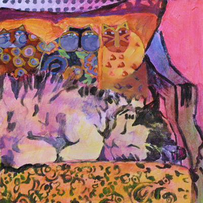
Here’s the finished painting ... nobody does sleep like a cat. Especially Ray. He’s a professional. Click here to check out some of his napping techniques.

SOLD
prints available


Someone to Watch Over Me • ©2012 Karen Mathison Schmidt
6 x 6 inches • oil on archival, museum-quality Gessobord
private collection • Vancouver, BC, Canada

And here are my work in progress photos:


Here’s the beginning, the initial sketch in acrylic, with acrylic glazes of quinacrodone rose, cadmium yellow light, and phthalo blue. I started out with quite a bit of detail on those Laurel Burch kitties gracing the pillow. I wanted them to be accurately whimsical, recognizable as her art.


And now I warm everything up with glazes of yellow and rose, 
with some blue on Ray’s body in the shadowy places.


Next, after letting the acrylic underpainting dry for about 30 minutes,
I start adding the oil colors, first on those watchful kitties ...


... working on them from dark to light ...


Here I’ve added the blue to the background of the pillow ...


... and here you can see I’ve loosened up the detail on the kitties just a bit. Also added just a hint of repeating highlights to suggest the rattan on the back of the chair which is just peeking over the top of the pillow. You only need a hint of repeating texture like this, because the viewers’ brains are really good at filling in detail and going “oh, that’s rattan.”


Now I start adding detail to Ray.


Don’t forget those cute “eye whiskers.” 
Remember: only a suggestion goes a long way
 on details like whiskers and fluffiness.


Here I’ve added the wall color, keeping brushstrokes loose so those luscious underpainting colors can peek through in places. Also adding details to the patterned fabric on the chair cushion ... okay, all together now: “only a suggestion will do!”


Continuing work on Ray. Look, decide, load brush, stroke. Look again, decide, load brush, stroke. Taking a page from Carol Marine’s book and applying only one or two strokes before wiping the brush and reloading with another color.


And now a page from my own book, with some final swashes of transparent color (paint with a generous amount of stand oil) in just a FEW strategic places: some rose on Ray’s head and left ear, and some orange to intensify the glow in the coral-y spots on the chair cushion, just a little yellow-y glow in the vicinity of Ray’s right elbow. Oh, and just a couple of thin strokes of almost-white-pale-yellow to better define the outside edge of Ray’s left ear. 

And then the all-important decision to STOP before things get overdone. 

Add signature ... and ... done!