Sunday, December 30, 2012

A new threshold


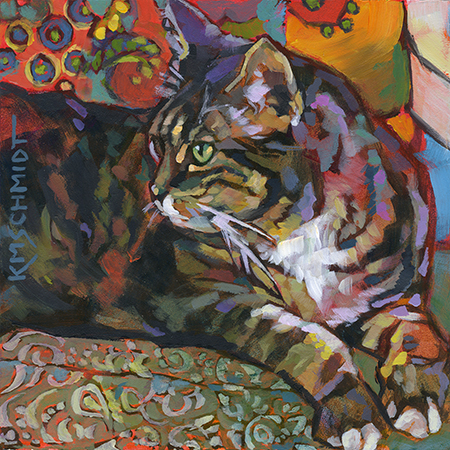
Threshold  © 2012 by Karen Mathison Schmidt, artist
12 x 16 inches • acrylic on archival, museum-quality cradled GessobordTM
gloss varnish for UV protection • sides painted dark umber
can be beautifully displayed with or without a frame

auction ends January 6

Whew! I can hardly believe the year is almost over ... I hope you all had a wonderful Christmas and I send my best wishes for a joyful new year! 

Oh, by the way, in case you were wondering about the last little changes to the painting in my last post (the difference between the last two progress pictures): 
1. I fixed the wall between Blue and the edge of the chair back - made it more pink
2. Blue now has two folds of skin showing to the left of his shoulder instead of three.
3. I made the part of the blanket just to the left of Blue’s front legs bluish instead of greenish.

Now, back to today’s painting: this is the pasture across the road after a couple of heavy rains. It started off as a late autumn landscape, but now that it’s finished it seems to have more of an early spring feel to me. Appropriate, because even though we’re officially just a few days into winter, spring is just around the corner and it will be here before I know it ... it’s TOTALLY true that the older you get, the faster time goes.

In fact, I’d better hit the hay because tomorrow morning will be here in no time!

Hasta mañana, amigos!

Thursday, December 20, 2012

Ensconced IV: Blue work in progress photos!


Last night I got a very nice email from an elementary art teacher in Ouachita Parish who is planning to study a few of my paintings with some of her fifth-graders, using the work-in-progress photos as a guide. How cool is that? I’m sincerely honored that I could be a part of their art learning experience!

Speaking of work-in-progress photos, here are the ones for the Blue painting (I thought you might also be interested in seeing my original reference photo, above. As you can see, I sort of rearranged the fringed blanket when I made my composition, I removed the etagere from the background and changed the wall from aqua to rose, and his tag from green to gold in the final painting):


Here’s my initial sketch, in Mars black acrylic (I just used water mixed with the paint for the washes.)

Next I add glazes (paint mixed with Liquitex acrylic glazing medium) of Prussian blue, Hooker’s green, cadmium orange, caput mortuum violet (a sort of dusty gray dark violet), raw sienna and rose madder for the wall behind Blue’s head. The part of his body that will be in shadow is Prussian blue glaze over a Hooker’s green glaze. Using transparent glazes for my underpainting at this stage allows me to still see all the lines and shadows of my beginning sketch.

Now I’ve added more glazes to deepen the colors and differentiate between warm, cool, and cooler areas of light. I warmed up that rose wall with a touch of cadmium yellow medium glaze. The light is coming from a window on the viewer’s right, so you can see that side of Blue’s face and shoulder is warmer than the other side, which is warmer than his body, which is totally in shadow (except for a slight highlight along the top of his back which I will add later). On the cool side of his face and chest I added a glaze of quinacrodone fuchsia, and to the warm side I added rose madder and yellow glazes.

Now I start adding opaque colors, starting with Blue’s eyes and the highlighted side of his face. Below you can see a large view of his eyes in the final painting.


I love painting Blue; he’s a beautifully muscular dog, and that combined with his smooth coat make for a lot of interesting shadows and highlights in his chest and shoulder areas. And here’s where you can see I started adding highlighted areas along his back. I kept the strokes of burnt sienna on his body really loose to let that bluish-green underpainting show through for deep shadowy areas.

Here I want to point out the very light touch of a vermilion glaze that I added to the left side of Blue’s face (our left, his right) to calm down that yellow highlight.

Now I’m starting to add color to the blankets. I sort of made up the flowery pattern on the back of the chair. Just because I wanted to. Keeping the brushstrokes really loose there leaves just a suggestion of the pattern, which is all I need to get the idea of a floral upholstery across to the viewer. Remember, one of the really interesting things about impressionist-type painting is that the viewer’s brain will fill in missing visual information from his own memories and visual experience, so a lot of different people looking at the same painting might be drawn to it because they find something vaguely familiar about it. I think that is SO cool.

More playing with the highlights in Blue’s chest and shoulders, and development of the blankets. for the texture of the blanket I layered little dots of a few colors in those areas. Not too densely, though. Remember, just a suggestion is enough. For the multicolored fringe I very loosely stroked it in with white ...

... and then added glazes of different colors over it. Then I added a glaze of dark gray over the part of the fringe on the right that appears to be in shadow. Also, the fringe on the right has more contrast between the shadows and highlights than the fringe on the left side of the painting, because the blanket on the left side is in a softer light caused by Blue’s body blocking the bright light coming in from the right. Also, here you can see that I’ve added a few light touches of pink and yellow to the floral back of the chair, just to give it a little more depth, and to pick up that yellowish light coming in from the right.

And then, where, oh where to sign this puppy? The bottom of the painting has interesting lines I don’t want to mess with, so I decide to go for a subtle signature in the shadowy side of the background wall.

And finally, just three little adjustments and fixes. Can you see what they were?

Tell you tomorrow!

Happy painting!


Wednesday, December 19, 2012

Something Blue: a retrospective

SOLD

Ensconced IV: Blue  © 2012 by Karen Mathison Schmidt
7 x 5 inches • acrylic on archival, museum quality GessobordTM

private collection • Norrköping, Sweden


Here’s my latest painting of Blue, complete! I didn’t get all the progress photos uploaded from my camera yet, so I’ll be adding those later. 

This afternoon I retrieved all my previous paintings of Blue, just because I was curious to see how my style has been progressing. Here they are, from earliest (2008) to newest:

 Here he is not even a year old yet. Still a teenager.

 Blue is the one in the back, with his back to us.


 Napping with Sophie.


Tuesday, December 18, 2012

More work in progress ...

Ensconced IV: Blue • WORK IN PROGRESS

Only one more week ’til Christmas, and lots of projects these last few days, but I did manage to do some more work on this one of Blue. Hopefully I’ll be able to finish tomorrow. Love this hound dog!

Hope you can make some quiet time for prayer this week, notice how you are blessed and be filled with gratitude. 

Hallelujah! Amen.

Thursday, December 13, 2012

A new Blue


Here’s the beginning of a new painting of our Blue. 
Tomorrow I’ll add color, but for now I’m kinda lovin’ this sketch. 

Saturday, December 8, 2012

Looking forward ...

SOLD

Heirlooms II  © 2012 Karen Mathison Schmidt, artist
7 x 5 inches • acrylic on GessobordTM
private collection • Salem, Oregon


The paperwhites and daffodils which were planted around here circa 1900 usually don’t bloom for a few weeks yet -- the paperwhites late in January and the yellow Daffodils in February. This year they’re already pushing their leaves up through the grass, so I imagine we’ll be seeing them earlier than usual. I just couldn’t wait to paint them, so I dug up a reference photo I took last year, and here’s the painting I just finished today (I plan to add work-in-progress photos later).

I’m a bit exhausted now, so ciao for now!

Wednesday, December 5, 2012

Watchin’ all the squirrels go by ...


SOLD

Squirrel Watchers  © 2012 by Karen Mathison Schmidt
6 x 6 inches • acrylic on archival, museum-quality GessobordTM
private collection • Scottsdale, Arizona

Here are Matilda and Roadie, engaged in one of their all-time favorite activities. Yep, it’s a squirrel stake-out!

My main challenge on this one was to combine some pretty busy textures  – Roadie’s markings, the leaves on the vine-covered oak, and the dappled light on the grass in the distance – in such a way that they didn’t compete with each other. Keeping Matilda’s coat and the portion of lawn in the middle distance relatively smooth help to balance those busier textured areas.

Another challenge: I wanted to see if I could paint a small painting with a fair amount of detail using one brush: a synthetic sable No. 10 flat. I only changed to a No. 2 round for my signature.

And here are my work-in-progress photos:


Monday, December 3, 2012

Retro Bailey


SOLD

Backward Glance  © 2012 by Karen Mathison Schmidt
6 x 6 inches • acrylic on GessobordTM
private collection • Poway, California


Remember this pencil sketch I did a while back?


Well, today I decided it was high time I made into a painting. Here’s Bailey, lying on a patterned cushion with a brightly colored pop-art style pillow behind.  I purposely left thick outlines around her to keep more of a pop-art illustration-y type feeling for the whole painting.


 I started by going over the pencil sketch loosely with only shades and washes of mars black acrylic.

 I used a vermilion glaze over the entire painting, then added a burnt sienna glaze to Bailey, with phthalo blue glaze for the underpainting of her eye.

I added more glazes: some phthalo blue in the shadowy parts of her fur, and a thin fuschia glaze to the pillow in the background and the parts of her coat which will end up being the lightest areas. Then, starting with her eye, I started adding opaque acrylics to the painting. Here’s a close-up of her eye in the finished painting:


I start by adding a few highlights, like on the tip of her nose ...

 ... and her ears and the fur on the back of her head. Conventionally, artists wait until last to add the highlights. Not me. Not this time. Once I had her eye finished, I was too excited to wait.

I decided to keep the pinkish vermilion of the underpainting on the side of her neck. It was just too cool to cover up!


Last, I did the background fabrics. Don’t let patterned fabrics intimidate you. Remember, just a suggestion of the pattern is enough. I painted in the olive green of the cushion very loosely to let the underpainting show through a lot here ... it helps keep things lively!

Saturday, December 1, 2012

2 cute
2 be
4gotten

Remember back in the day when we used to write that in each other’s yearbooks in Junior High? Little did we know we were foreshadowing texting shortcuts!

SOLD

Jo  © 2012 by Karen Mathison Schmidt
6 x 6 inches • acrylic on GessobordTM
private collection • Poway, California


Today I confirmed something I already suspected: Jo is too much fun to paint. After working on a couple of paintings that are a little more detailed, I wanted to keep this very quick and loose, so I decided to see if I could capture her with minimal strokes. It was very energizing! 

This is from a picture I took of Ray and Jo cuddling together. I plan to do a larger one including Ray, but I wanted to do this little quick one of just Jo first.

Here are my work-in-progress photos:

My initial sketch with an overall glaze of quinacrodone fuchsia. Here in the sketch her eyes look kind of scary. But I’m not worried. Well, maybe just a little.

Here I’ve added a glaze of bright violet where the pillow will be behind her, and caput mortuum to darken the blankets.

Next, I do her eyes. Keeping in mind that even though they only take up a tiny portion of real estate in the overall painting, they are oh, so important in getting across the feeling of the entire painting. No pressure :)

Always remember, eyes are glassy and reflective, so are never just one color. You can see different colors reflected in them in the close-up detail I’ve included down at the end of this post.

 Continuing to add color, with quick, definite strokes.

When I say quick strokes, I don’t mean unplanned. I look at my reference and decide color and shape and placement of each stroke, then apply only one or two strokes before referring to the photo again and reloading for another stroke. It takes some practice, but when you get a rhythm going it’s really fun.

And all along I’m taking note of those serendipitous little places where the vivid underpainting shows through, all the while making decisions where to keep them, and where to lose them.

Almost finished. I’ve lightened and brightened the highlights, like on her forehead, the tips of her nose and paw, and a few touches of light on her fur, especially on her face. I also added a hint of whimsical pattern to the pillow and the blanket draped over the back of the chair on the upper left.

And here’s the finished painting. I warmed up few places in the pillow and blankets with a glaze of 
cadmium yellow light. A very transparent glaze, using a lot of glazing medium with only a teeny amount of paint, to add just a touch of yellow, not an overpowering amount.

I’m looking foward to a lot more paintings featuring Jo over the next decade or so, plus. (God willing!)

Happy painting!