Tuesday, June 12, 2012

White Irises painting in progress

Wild White Irises • 12 x 12 inches • WORK IN PROGRESS


A very long but productive day. 

Just enough energy left to post this work-in-progress of some white irises blooming at the foot of a grand old oak tree, and to wish you all a good night!

Monday, June 11, 2012

Roadie-licious!

SOLD

Ensconced II: Roadie  © 2012 by Karen Mathison Schmidt
7 x 5 inches • acrylic on museum quality, archival GessobordTM

private collection • Poway, California

Here it is, folks: my first Roadie painting ever! And I’ll say the same thing I said the first time I painted Andy. I don’t know why I waited so long to paint him. I guess maybe I thought all his wonderful spots and half-and-half face were a little intimidating, but it turns out he was oh, so fun to paint. Here he is, sitting in my favorite chair, but looking so comfy and ensconced that I didn’t have the heart to make him move. Instead, sensing a portrait in the making, I took my phone out of my pocket and snapped a reference photo. 

As it turns out, I didn’t have to wait long before he had vacated the chair and was on to his next project: dragging a fallen tree branch out of the yard and trying to get it through the back door into the house.

Must be the Puppy Chow.

Anyway, here are my work-in-progress photos. My palette for this painting was Mars black, burnt umber, diox purple, phthalo blue, Hooker’s green, cadmium yellow light, Naples yellow, yellow ochre, vermilion, magenta, quinacrodone fuschia, and titanium white. 

First, the initial sketch in black. I used acrylic glazing medium mixed with the black for the gray areas. I wanted the sketch to be sort of finished looking, because I wanted to use just layers of glazes for most of the rest of the painting, with opaque colors in just a few places, and let the vivid underpainting show through a lot more than I usually do.

After the black and gray layer was dry (only a few minutes) I added glazes of magenta, cadmium yellow light, hooker’s green, and phthalo blue. I had in mind that I wanted to let the underpainting colors to be the main colors of the red quilt and the green blanket ... the reason I chose the magenta and green for the glazes in those areas. And Roadie had a lot of bluish highlights in his grays, and sunny highlights on the white of his chest and paws ... the reason I chose those glazes for those areas.

Next I started layering more color glazes, deepening the colors of the background fabrics, and adding purple in some of the cooler, shadowy areas. You can see that I also started lightening up his chest and paws with some opaque white mixed with just a touch of vermilion.

Next, those two different colored eyes.

Next I added some more opaque pale colors to define the lightest parts of his spots and to develop the area around his nose and mouth.

I continued to add more whites and light grays and greens to develop his coloring, added opaque light ochre, Naples yellow and green to the little embroidered flowers in the quilt. I also added some yellow glazing in certain places on the red quilt and the green blanket, to emphasize the highlights from the sunlight coming through the window. Notice that I also “redded out” the greenish shadow to the right of Roadie’s head, because when I stepped back and viewed the painting from a distance, the dark shadow was muddying up the distinctiveness I wanted for Roadie’s shape on that side.

Here’s the final version.

And here’s the actual dog:


Saturday, June 9, 2012

Cat painting finished!

SOLD

Rose Queen  © 2012 by Karen Mathison Schmidt, Louisiana artist
7 x 5 inches • acrylic on GessobordTM

private collection • Jacksonville, Florida

Before I did the illustrations for Amy’s book, it had been a while since I had used acrylic for an entire painting. I decided on acrylic for those illustrations because, just in case my client wanted any adjustments or changes, I wanted to be able to make them easily and quickly. I loved that process so much that I’ve decidd to do a few more all-acrylic paintings, starting with this one.

Here are my work-in-progress photos ...

First, glazes of Hooker’s green on the pillow, cushion and eyes, magenta on Bailey’s body, and vermilion on the chair ...

... followed by glaze layers of Phthalo blue in certain areas, Dioxanine purple on the bottom of the chair, and vermilion on the cushion and pillow.

When adding the finishing layers, as usual I start with the eyes (notice that her right eye is a little darker than her left, because the daylight is streaming in softly from the right edge of the painting) ...

 ... and work my way out from there, lightening the lightest areas up gradually ...

 ... bit by little bit.

As I went along, I constantly assessed which parts of that vivid underpainting I wanted to leave showing. I left a good bit more than I usually do, especially on Bailey’s body and face, because I was liking the overall effect.

After I finished painting the chair, I added a glaze of Cadmium yellow light just on the right edges, along with the top right corner of the pillow and some of the highlights on the roses, and on the wall at the top right of the painting, just to suggest a sunny glow coming in from the right. And last I lightened up her whiskers, added just a couple of brushstrokes of the palest yellow white on her chest blaze, and used a frosty white glaze to lighten up the background of the rose pillow. It gives it a kind of a frosted glass look which I like

By the way, the pillow in the photo wasn’t covered with roses. I added those to give the setting a more cottage-y feel. And that’s it for the progress on this one!

Happy painting!

Friday, June 8, 2012

A new cat painting ...


After spending the last few weeks on some lovely commissions, it’s back to my choice of subject, and for my first selection of the summer, of course it would have to be a dog or a cat. Even though I love the sketchy quality of this initial stage, I can’t wait to start adding color layers!

You might recognize the chair from this one I did of Ray earlier in the year:


Not that I’m marketing or anything.

I’m just sayin’.

sccdfffffffffff00000000 
(The above line of nonsense is courtesy of Ray, who just walked across my keyboard on his way to one of his favorite napping places on my desk next to the scanner.)

*pause while I take photo of sleeping cat*

And now I’ll take my cue from Ray and tiptoe quietly downstairs to join Hubby and dogs for some relaxation time ... shhhhhhh ...

Goodnight, all!

Thursday, June 7, 2012

I love a mystery!

Wa-hoo! I’ve finished the illustrations for Murder and Mayhem in Goose Pimple Junction by Amy Metz. The book comes out in August, from Iconic Publishing. I can’t wait to read it ... I LOVE a mystery! Here’s the link to her website so you can read all about it.

Here’s the painting for the back cover of Amy’s book:

Welcome to Goose Pimple Junction © 2012 by Karen Mathison Schmidt
14 x 11 inches • acrylic on cradled Gessobord

And the final version of the painting for the front cover: 

 Slick & Junebug’s Diner © 2012 by Karen Mathison Schmidt
14 x 11 inches • acrylic on cradled Gessobord

And finally, how the finished back and front covers will look:


Friday, May 25, 2012

Finished painting for book cover!

Slick & Junebug’s Diner
14 x 11 inches • acrylic on GessobordTM

Unless we decide to make further changes, here’s the finished painting for the front cover of Amy’s book.  The painting is 11 x 14, so because the book is going to be 6 x 9 inches, the image will be cropped a little on the sides. The picture below is NOT the actual book, but an EXAMPLE of what the cover MIGHT look like when it’s done:

Today on Facebook, Amy shared a tweet that her publisher, Iconic Publishing, send out today: 

“Murder & Mayhem in Goose Pimple Junction by Amy Metz: 
Text is ready and formatted for August launch!”

Super exciting ... I guess now all they’re waiting for is me to finish the art for the BACK cover! (Check back for work-in-progress on that ...)

Meanwhile, here’s another painting waiting to happen: Roadie watching for Paul to come home from a trip to town. 

He’s a real handful most of the time (Roadie, not Paul) ... but he does have his moments!

Tuesday, May 22, 2012

A quick note of work-in-progress ...

Slick & Junebug’s Diner • 11 x 14 acrylic WORK-IN-PROGRESS:

Just a quick post to show work-in-progress on the painting for Amy Metz’ book cover that I’m working on. Working in acrylics, I’ve been building up the layers from the underpainting, starting with the stormy sky and then working from top left down and toward the right. Here’s where the painting is so far (I can hardly wait to get to that red ’54 Chevy pick-up parked in front of the diner!)


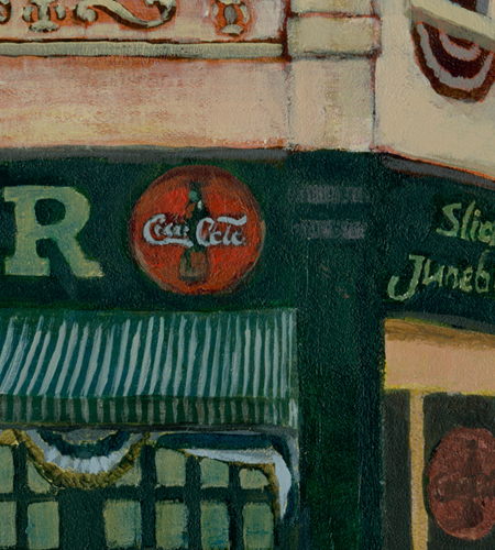
One of my favorite things so far: the Coca Cola sign on the side of the diner.