Thursday, June 30, 2011

Rising to the Daily Paintworks
“Old Mill” Challenge


SOLD

Mill River Glow © 2011 Karen Mathison Schmidt
6 x 6 inches • oil on museum-quality, archival Gessobord
private collection • Saint Paul, Minnesota 
I took a little break today from the Napscape sleeping dogs painting to participate in this week’s challenge on Daily Paintworks: an old abandoned mill. I decided to change the light in the photo to indicate my favorite time of day ... dusk or dawn? I’ll leave that to you!

Monday, June 27, 2011

Dogs dogs dogs

Napscape WORK IN PROGRESS detail:


There are work-in-progress photos below,plus a few words about technique, but first I thought you might enjoy a few dog pics I took today:


Here’s XL-sized Blue trying to fit into an M-sized chair. Hey, I just noticed that this is the pillow that’s in today’s painting!


And here we see that XXL-sized Andy has made a wise choice of napping venue: the quilt-covered sofa in the painting. It sleeps two redbone hounds or one Andy. He’ll be able to dream big here.


That is, if the paparazzi will PLEASE leave him alone.


While I was taking pictures of Blue and Andy, Trixie trotted over to worm her way into the action.


Be sure to get my best side.


Smile, Trixie, smile!


What do you mean? I AM smiling.


And now, here are my work-in-progress photos for today’s painting:


Here’s where I left off on Saturday; the detailed value sketch in indigo acrylic.


I develop the underpainting using glazes of acrylic. Here’s the first layer of glazes. Recently I was asked how I choose what colors to use in the underpainting. Well ... um ... that’s a really good question. Sometimes it’s pretty arbitrary, but usually I’ll divide a painting in my mind into 3 to 5 main areas of color, keeping the areas very general, not detailed at all. For the parts of the subject that are in full light, I’ll block in colors in the underpainting that are complements of the colors in the finished painting; and for the parts that are shadowy I’ll use colors that are similar to what the finished colors will be, only darker, cooler versions of those colors. Sometimes you could give yourself a headache trying to figure out exactly how to follow these rules, so don’t worry at all about getting the exact complement, or what the main color of a section in the finished painting is going to be, especially a picture that is full of detail. I just use these guidelines in a very general way, to help me get started.


For this painting I had in mind four main areas: 1) the part of the quilt covering the back of the sofe, behind the dogs; 2)the blanket and pillow; 3)the dogs themselves; and 4) the foreground section of the quilt, which is in more light than the shadowy background part of the quilt.

The main finished color of the dogs will be red-orange-ish, so I use a yellow glaze on top of a phthalo blue glaze, and then another phthalo blue glaze on top of the yellow, to end up with a dark turquoise. The quilt will end up being multi-colored, so I arbitrarily chose phthalo blue for the underpainting, with a very washed out yellow glaze. It’s hard to tell in the photos, but the front of the quilt is a little bluer than the dogs and the dogs a touch more turquoise.

The pillow and blankets, plus the wall behind the sofa at the right end of the painting, will be shades of teal and green, so I chose shades of red for the underpainting in those areas. I started with a quinacrodone rose, and added a yellow in some places to make it a little warmer red. The pillow I kept rose colored.

The part of the quilt covering the back of the sofa is more in shadow than everything else, so I wanted that part of underpainting to be cool-ish in color. I started with a phthalo blue glaze, topped by a glaze of quinacrodone rose, so that it ends up purple.


Once the acrylic underpainting is completely dry, I start adding the oil colors. This is just my preference, but I like to start with a part of the painting which might require more concentration to get just right than other parts of painting might require. Soooo ... in this painting, that would be Sophie’s face.


With oil painting, I like to keep the colors slightly separate at first; the longer drying time allows me to blend colors after I finish Sophie’s entire face.


I make a conscious decision where to blend and where to keep separate, because once you blend, you can’t unblend. Keeping the colors separate and blending later after I’ve had a while to look helps me to keep from overworking the paint. Another thing to keep in mind is: you can always scrape away paint with a painting knife to allow the underpainting to show through in certain places. Or wipe away paint for a stained or glazed effect.

Tune in tomorrow for more progress!

Saturday, June 25, 2011

A new dog painting in progress ...

A new work-in-progress:


This one is going to be fun; it’s a good size, 10 x 30 inches, and it has quite a bit of detail ... Sophie and Blue napping on the sofa, ensconced in blankets, quilts and pillows. I finished the bones of the underpainting today, done in indigo acrylic.

I hope you like the title as much as I do ...

... wait for it ...

... Napscape !

An underlying joy

Let me start by saying to all my friends and family: I’m fine! Everything is going well with us, and we thank God every day for His provision and blessings. I just felt inspired and led to do this painting; someone out there may may be looking for this right now.

Though My Heart Is Torn © 2011 Karen Mathison Schmidt
5 x 7 inches • oil on museum quality, archival Gessobord

Because we live in a fallen world, we are going to go through rough times in our lives. Nobody’s life is good all the time, but in those stormy seasons when it feels as though our hearts are being ripped apart, if we have a relationship with God through Jesus, and trust in His faithfulness to us, believing His promises and knowing that His love for us is unfailing, we will be undergirded by an unexplainable joy and peace that knows no bounds, even in the midst of life’s fiercest storms. I can’t explain how this is ... it’s a beautiful mystery to me ... but I do know that it is.

The idea for this abstract painting came while I was driving home the other day and the Casting Crowns song “I Will Praise You in This Storm” came on the radio. I’ve put all the lyrics at the end of this post, but the words that really caught my attention:

“... and every tear I’ve cried You hold in Your hand
You never left my side and though my heart is torn
I will praise You in this storm.”


I started imagining then how I would depict this idea, and yesterday after I had been working for several hours on a larger dog painting with quite a bit of detail, I took a break from that one and started working on this. Once I got going on the actual painting, because of the spontaneity of my abstract technique, it kept changing while I was working on it, but I liked it because the picture was starting to look way more emotional and full of spirit than I had imagined it.

One thing I’ve tried to learn by doing these abstracts: when something cool unexpectedly happens, most of the time it’s best to go with it ... and whenever another piece of the painting falls into place, leave it!

Here are some details:


Praise You in This Storm
words by Mark Hall/music by Mark Hall and Bernie Herms

I was sure by now
That You would have reached down
And wiped our tears away, stepped in and saved the day
But once again, I say Amen, and it's still raining

As the thunder rolls
I barely hear Your whisper through the rain, "I'm with you"
And as Your mercy falls I raise my hands
And praise the God who gives and takes away

And I'll praise You in this storm and I will lift my hands
For You are who You are no matter where I am
And every tear I've cried You hold in Your hand
You never left my side and though my heart is torn
I will praise You in this storm

I remember when I stumbled in the wind
You heard my cry, You raised me up again
But my strength is almost gone
How can I carry on if I can't find You

As the thunder rolls
I barely hear Your whisper through the rain, "I'm with you"
And as You mercy falls I raise my hands
And praise the God who gives and takes away

And I'll praise You in this storm and I will lift my hands
For You are who You are no matter where I am
And every tear I've cried You hold in Your hand
You never left my side and though my heart is torn
I will praise You in this storm

I lift my eyes unto the hills
Where does my help come from?
My help comes from the Lord
The Maker of Heaven and Earth

And I'll praise You in this storm and I will lift my hands
For You are who You are no matter where I am
And every tear I've cried You hold in Your hand
You never left my side and though my heart is torn
I will praise You in this storm

Back Yard Pics

A late blog tonight ... I just got home about an hour ago from an impromptu “girls’ night out”; we met at church to attend a concert by the Louisiana Baptist All State high school choir (wonderful!), who are getting ready to depart for a week-long concert & mission tour. Afterward four of us went to the Starbucks coffee shop in Barnes & Noble bookstore for some treats and conversation ... talking about everything from work to blogging, to spouses to dogs to cats, to dogs vs. cats, to morning persons married to night owls, etc. ... lots of laughter and lots of fun; I enjoyed myself immensely, came home to an enthusiastic greeting from dogs and husband, a not quite as enthusiastic “oh, were you gone somewhere?” from the cats, and wanted to give just a little update before I join Paul to watch today’s Jeopardy and then hit the hay.


Today I worked on a new dog painting, plus another little abstract, but they’re not quite ready to show yet, so here are some photos from the back yard this afternoon.


We had quite a bit of rain day before yesterday, and it weighed down this blossom laden branch on one of our big crepe myrtles. I like the way it makes a kind of archway of flowers to walk under.


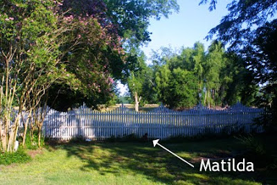
And here’s Matilda, gazing out to the pasture, daydreaming about her next escape, no doubt.


What? Me, escape?


Don’t make me laugh!

Wednesday, June 22, 2011

Experimenting with texture


SOLD

By Moonlight © 2011 Karen Mathison Schmidt
7 x 5 • oil on museum quality, archival Gessobord

private collection • Houston, Texas

This little landscape just sort of emerged while I was experimenting with color and texture. Especially texture.

It seems that every time I try an abstract, a river happens. Hmmmm ...

I used a painting knife most of the time, painted a layer and scraped it off several times in different places, building up layers of color. On the lower right part I wrinkled up a piece of plastic wrap and stuck it to the painting and then removed it, just to see what kind of texture it would make. Interesting. Then I patted the plastic into some of the paint on my palette and stuck it to the painting again and again removed it. More interesting.

Not my usual technique, but every now and then you just have to play around so you can get going again!

I wish it wasn’t getting dark already ... I’m not ready to stop ...

Well, I guess I’ll start tomorrow with renewed energy; I’ll need it for my next painting, featuring Blue and Sophie, entitled A Long Nap.

Tune in tomorrow to see progress!

Sunday, June 19, 2011

Cool reflections


Our dining table is made of reclaimed wood and antique ceiling tile, and is covered by a sheet of glass. So when the angle of the afternoon sun coming in the dining room window is just right, the tabletop is almost like a mirror. I passed by the doorway to the dining room this afternoon and saw this cool reflection of the oak trees, so I added some little bottles that I keep on the kitchen windowsill, and took this photo. (The blue bowl over to the right is actually sitting on top of an old radiator beyond the table, right in front of the window.)

Maybe I’ll try to paint this ... MAYBE.

Feel free to try it yourself if you like. If you do, and you post it on your blog, send me the link and I’ll post it. I’d love to see what you come up with!

Happy Father’s Day!
plus something from the rose garden ...

Happy Father’s Day, all you dads out there (and especially mine)!

Rosy Path ©2011 Karen Mathison Schmidt
6 x 6 inches • oil on museum-quality, archival Gessobord
gloss varnish for UV protection

CLICK HERE TO BID
Auction ends June 26

Something loose and fun to shake myself out of getting too tight with the brushstrokes! After the last several paintings which were a little larger and more detail-oriented, I wanted to do something really loose and almost abstract. Plus I had a faint headache this afternoon, so I wanted something I could really relax with, and this sunny garden sidewalk at the American Rose Center here in northwest Louisiana was just the thing.

Here are the work-in-progress photos:


I dived right in blocking in the main areas with purple, yellow and burnt sienna.


I wanted to position the roses before I started filling in the foliage. I wanted the flowers to be random and since it’s really hard for a human being to position objects randomly (our brains automatically want them to be evenly spaced, or symmetrical, or with a pattern of some kind) I used my reference photo and placed the roses pretty much how they were in the garden that day.


Then I started filling in foliage and the shadow of the roses on the sidewalk.


The white concrete sidewalks at the Rose Center really make the roses themselves pop with color.


Here in the final painting you can see that I softened the edges of the shadows just a bit by adding a lighter gray. Also, I added some confetti specks of light, bright color (but not too much) here and there to add a little more of a sunny feel of the composition.

Saturday, June 18, 2011

Bailey in a precarious situation ...


SOLD

This Side Up © 2011 Karen Mathison Schmidt
12 x 12 x 3/4 inches • oil on 3/4" cradled artist panel

private collection • Jacksonville, Florida


Here’s the finished painting.

Good night, all!

Friday, June 17, 2011

another glimpse ...

This Side Up work-in-progress detail:


Well, burning the candle at both ends finally caught up with me yesterday. I guess I’m not as young as I used to be.

*sigh*

Anyway, I’d been feeling a little under the weather, so I kind of played hookey and took yesterday off. This morning I packaged up some paintings and sent them off to their new homes, did some updates on my blog and website, and then this afternoon I finally got back to the easel and had a productive afternoon of painting. I finished the book stack, and part of the chair, and the cardboard box. I see from looking at the detail above that the left side of the top book isn’t quite right. I’ll need to fix that tomorrow!

The way I’m working on this one seems a little different to me than usual. I’m sort of meandering along and finishing each little part before moving on to the next. It reminds me of something I read in a Dean Koontz interview about the way he writes. Very different from the way a writer would usually work. He said that instead of finishing a rough draft of the entire work and then going back and making revisions and edits, he works on a book one page at a time, editing, revising, correcting and perfecting that one page before moving on to the next. I found that very interesting.

Anyway, this afternoon I started with the top book in the stack, moved down to the next and then the next, finishing each before moving on to the next. When I got to the bottom of the stack I just kind of naturally moved left to the chair and then up to the arm and finally the cardboard box, again finishing each little part before moving on to the next. Working on it this way today was very relaxing to me somehow.

Here’s a close-up view of the books; you can see how I’m letting the underpainting show through in places.


I really think I’ll be able to make short work of the rest of the painting tomorrow, and have the whole thing to show. I have been taking work-in-progress photos, too, but I’m going to save them to post all at once.

Wednesday, June 15, 2011

Painting progress

This Side Up work-in-progress detail


Today I varnished paintings, packaged paintings for shipping, answered email, updated my eBay store and my website ... THEN continued work on this painting. I’ve said it before and I’ll say it again: I love painting Bailey. A tabby’s face has such interesting markings.

Here’s the work-in-progress so far:


A phthalo blue glaze in the areas which will be darkest in the finished painting ...


... a fuschia glaze over the phthalo and in the mid-range areas ...


... and a yellow glaze in the lightest areas, and over the fuschia areas, bringing them to more of an orange-y color. Here you can get an overall sense of what the values in the finished painting will be: how much dark, medium and light. I love the subject being backlit by the light coming in the window.


After the acrylic underpainting is dry, I switch to my oil paints, and start with Bailey’s face, beginning with her eyes. Since the light is coming from behind her, I have to remember that her eyes and the lighter markings on her face will still have to be grayer (not as bright and pure) as if I were painting her with her face lit. And keeping the color on her face a little darker and not as contrast-y (I just made that up, but I think you can probably figure out what I mean -- you’re a smart bunch of cookies) will make the highlights around her edges and around the edges of the flowers seem more dramatic. There are times in life when you really don’t want drama, but in this case it’s good. Dramatic lighting makes the painting MUCH more interesting.


Below is the final version of Bailey’s face for this one. You can see how I softened her mouth lines just a bit, so she doesn’t look quite as grumpy. Below that are details from two other Bailey paintings where her face was in full light, so you can compare the colors and see the difference.


Tomorrow I plan to finish this and have a completed painting ready to show you.

Hasta mañana, amigos!

Tuesday, June 14, 2011

Bit by bit ... putting it together ...

This Side Up work-in-progress


Here’s my sketch in indigo acrylic, the first step in my painting for this week’s "Balance" Challenge on Daily Paintworks.

Having been a graphic designer and illustrator for my job for almost 30 years, I really like the “assignment” feel of these challenges. Especially this one. I’m treating it like an illustration assignment. Here’s a little bit of how my thought process went on this one:

First I wandered about the house a bit, looking at stuff. What could I stack up that would be interesting and different from what everybody else was doing? Hmmmm. I thought of pillows. I thought maybe a stack of books with a cup of coffee on top. Paul said he could balance some books on his head if I wanted. Hmmm. Books ... books ... I was really starting to like the books idea.

Then, as I was passing by one of the bookcases in the upstairs hall I remembered that weeks and weeks ago when I was organizing bookcases up there, Bailey had climbed into a box that was sitting precariously on top of a stack of books on one of our MIT library chairs. No, we didn’t steal the chairs from the MIT library; Paul’s dad bought them decades ago at a sale when the library was getting new furniture. Then he gave them to Paul. Now they’re Paul’s and mine and I love ’em.

ANYHOO, back to our story. I remembered that on that occasion I had taken a couple of pictures of Bailey in the box on the stack of books on the chair. Soooo ... to the computer!

After browsing for just a few minutes in my folder labeled “cats,” I found the subfolder called “cats and books.” I’m so organized. Only virtually, though. My real-world office/studio is a mess right now. And so, I found the photo:


Hooray! But the lighting was pretty boring, so I decided to re-create the situation in a prettier setting, with more interesting light and a more colorful stack of books. Soooo ... to the dining room!


I put together this set-up and, using a print-out of the original photo as a guide for the angle, took several photos.  I wanted to get the angle of the chair and the box as close to the original as possible, because Bailey was sure not going to cooperate and pose in the box again, so I was going to copy her from the original photo and add her to this photo for a reference. I chose the books mainly for color, but they happened to be books I like, so that’s a bonus.


Douglas Martin’s The Telling Line, a collection of essays on book illustrators; Life in the English Country House (I love stuff about bygone days in England); Breathless by Dean Koontz, which is very good and suspenseful and funny and, best of all, as is Dean Koontz’ frequent custom, one of the key characters is a dog -- plus it’s orange, perfect to complement the bluish books in the stack; my Bible from my college days, Spoon River Anthology, an American classic; and Murder Ink, a mystery reader’s companion (I love a good mystery ... it exercises the little grey cells).

Everything was all set to put together, but when I put Bailey in the photo, the lighting was totally wrong on her. I had to look for a photo of her where the light was coming from behind her. Soooo ... back to the photo archives. Folder: Cats, subfolder: Bailey.


Aha! (By the way, don’t you just love how the pencil container behind her is positioned just right so it looks like she’s wearing a little crown with pencils and scissors on top of her head? Try to imagine it -- it’ll make you laugh.) This photo is just the thing! Except she’s lying down.


Here we go! But she’s really blurry. And she’s facing the wrong way.

So I used just her head from the baskets photo, added it to this body (it didn’t really matter if her body was blurry, at least the light was right), flopped the photo so she’d be in the correct position for the composition, and, using my original Bailey-in-a-box photo for reference, sized her and cropped her to look like she was sitting in the box ... 


... et voila! I didn’t tweak the lighting on her body, so I know it looks obviously Photoshopped in this photo, but that’s ok; it’s still a fine reference photo for the illustration I have in mind!